Hi everyone,
The android 12 developer preview is out and it’s been out a couple days and many of you have been asking me to cover it so I thought we’d visit it and see if many of you are interested in it now before we get started I would recommend not installing this on your main device I have this installed on the pixel 4 xl but if you have a newer pixel 5 for example I would not install it as its fairly buggy and this is a developer preview the beta will be out in a month or so based on what Google has said so its buggy enough that I’ve actually been stuck in an app not able to go home and had to reboot the device in order to get to the home screen.
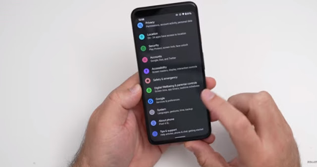
So I’ve had some strange bugs so far like that but it is a developer preview now this did come in about two gigabytes or so when I side loaded it onto this device and well take a look at the build number quick and you can see it says spp2.210219.008 so this particular build like I said is for the pixel 4 xl but all of the changes are the same and the first change is if you go to the home screen and you go to unlock the device if you’re not using the face unlock on the pixel 4 you’ll see that its translucent like normal but the button where you enter the passcode after you’ve actually put it in and hit enter no longer has a circle or a box around it.
So that’s a slight change there’s also no line here as well compared to the previous version the next thing is the music under the notifications for example looks blue now it has a blue theme on it based off the theme that you’ve set across your os and you’ll see its blue here its blue on the lock screen as well and if you hit this button in the upper right this was on the first developer preview you have a little pop-up that shows you the different devices you can connect to so this one just says phone speaker or if I had my pixel buds connected I could switch between the two so that’s new in this particular update now one thing that they’ve updated that’s not as good in this one is dark mode or the dark theme.

So if iIturn on dark theme you’ll see its sort of gray in this particular update if I go and pull down the notification shade it has more of a gray tone to it and not a true black look to it now this could affect battery since it’s still lighting up those pixels so it’s something they’ve changed that I’m not sure is for the better this could change in future versions of course now another option that’s kind of interesting is if we go into the camera we now have the option for split screen in camera so if you tap on the icon at the top when you’re in your app selector here for multitasking you can see split screen tap on split screen and then you can select whatever you want to go to so maybe well go to settings and now we have split screen with the camera as I’m moving it around in real time and then our settings below the next change has to do with widgets if I press and hold go to my widgets.
You’ll see they’re alphabetical and if I tap on one then I can see the widgets I can’t see them otherwise now so you can see them all categorized alphabetically tap on clock for example and now you have the clock widgets so you can select them that way let’s just clean this up a little bit but it’s a small change also with the first developer preview if you go to styles and wallpapers under grid there’s some new grid options as well so those were changed with the first one and it’s a change in this one as well you have a couple different options if you want giant icons or a three by three grid or just the default whatever you’d like it’s just changed a little bit and you’ll see it was a little buggy there as well now if I go into one of my videos they’ve updated picture and picture as well so if I swipe home.
It takes a moment shows up and I can move the picture and picture screen around and I can also expand it to full screen almost now almost edge to edge also while I’m busy doing something else I can swipe it off the screen now on either side so I can leave that playing you can still hear it if I turn it up it’s still playing and just resumes in the background and as you’re going through this maybe you’re just going through different apps or maybe you’re in your camera you can swipe it off to the side and still have it playing unless you’re recording video of course then you would want to pause this but it’s just something they’ve updated here a little bit so that’s been updated for picture-in-picture and it’s a little bit smoother when you go into it and out of it now there’s a new option that’s been added for a one-handed mode.
So if we go into our settings scroll down go to system go to gestures scroll down again we have one-handed mode and we can turn this on or off if we turn it back on we have the option to swipe down into a one-handed mode it works very similar to apples reachability on ios can swipe up or it will time out as well after eight seconds of inactivity it will time out and you’ll see it’s a little bit glitchy there as well so I can pull down like this and if we leave it for a few more seconds well wait for it to time out it should go back up but you’ll see it says exit when switching apps and then you have the timeout of inactivity and there it goes back up where it belongs so you have that throughout the os and it’s been added for everything now also if we go back into our settings and then we go to connected devices under connected devices go to connection preferences.

And then go to nfc there’s a new option that says required device unlock for nfc so it’s just an option for security and you can see there’s new toggles from the first version of the developer preview but it says require device unlock for nfc allow nfc payments and transit use only when screen is unlocked so you now have that option as well so it’s just a nice little addition that they’ve added there also under battery they’ve made some changes as well so if you go to battery you now have the option to just view battery usage here it was always a little bit of a pain to go to the three dot menu and then go to your options now it’s just one tap into your battery usage so it’s a nice little update there and then.
Also the battery saver option is now just a switch so before this wasn’t just a switch you had to go into it and then then actually turn it on like this so you’d have to go into it every time to turn it on now it’s just a little bit easier and you can tap a switch so they’ve updated that in settings as well also there’s a new option in accessibility so if we go to accessibility under accessibility we go to text and display under text and display we now have the option for turn screen darker and this is sort of similar to force dark theme where you can force it to change it to a dark theme on all the apps possible so if you turn it off.
For example you’ll see it sort of has some bugs there as well and it will switch back and forth and sort of try and force this throughout different apps so it’s a nice little option there it’s just been changed around here now in addition to this there’s a couple developer options you can’t really see that have to do with curved displays so developers have more options to see if the display is curved and then adjust their apps accordingly so that’s something that’s been changed there’s also a hidden android 12 gaming toolbar that has a dashboard for streaming your content so that is here it’s not turned on yet but it’s something that they’re adding in the future it looks like and so those are the major changes with developer beta 2. like I said this is fairly buggy and I don’t expect it to be stable until beta 1 comes out based off the android timeline that shouldn’t be too far away and it will be much easier to install of having to side load it.
Comments
Post a Comment